MNU: Online Menus
A product/brand I designed and developed to provide restaurant owners with well-designed, mobile-friendly menu websites.
About this Project
In a pandemic era, many restaurants made an abrupt shift to QR-activated digital PDFs in place of traditional physical menus. As a frequent restaurant-goer, I began to notice a lack of well-designed, mobile-friendly menus. The digital PDFs and makeshift lists were not suited for small devices and required endless zooming to read.
To solve all these menu problems I designed and developed this product, MNU, to help restaurant owner’s save time, save money, and make their customers happy.
Goals
- Design a mobile-friendly, modern-looking menu website template
- Allow the client to edit content without a developer
- Create a landing page to market the product
Key Features
Product Demo
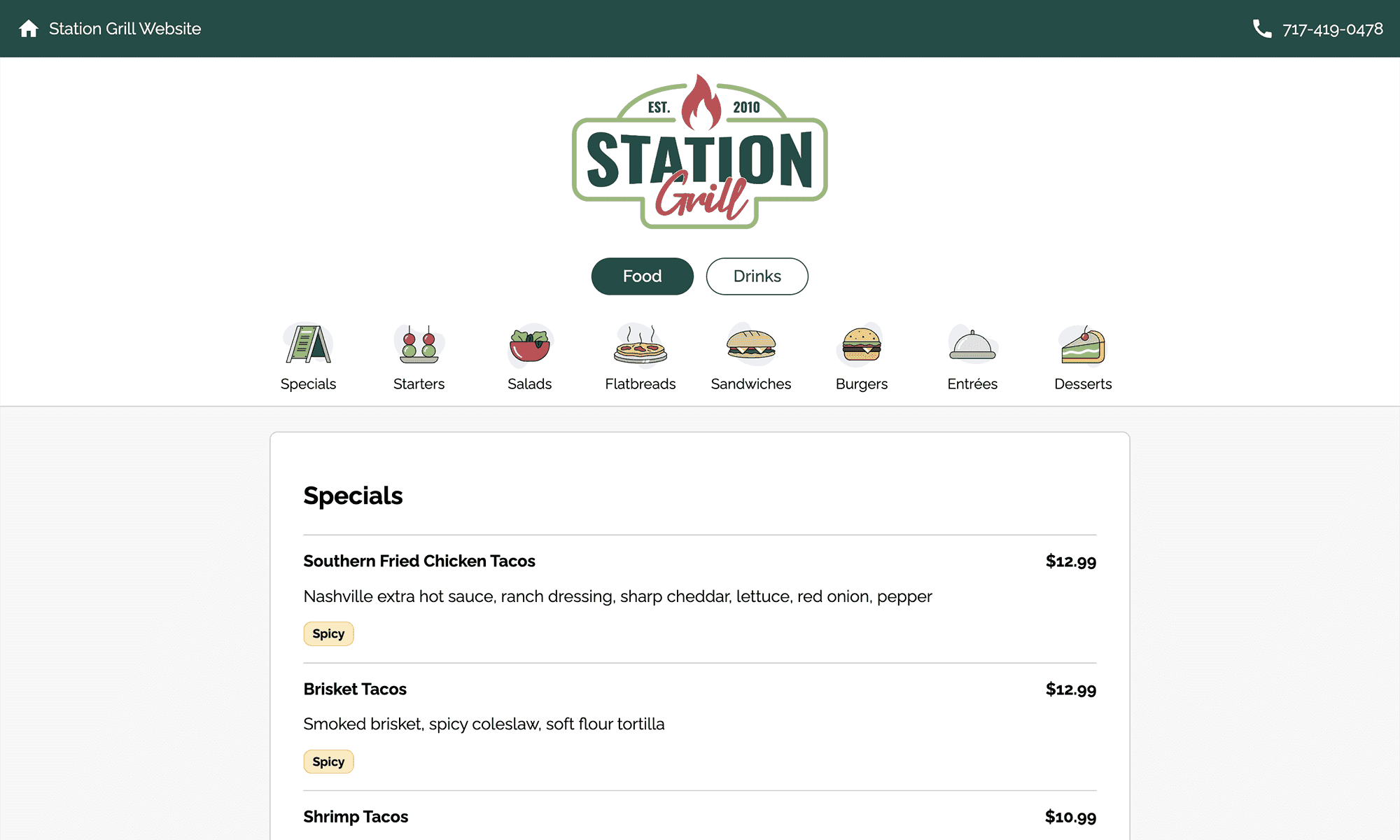
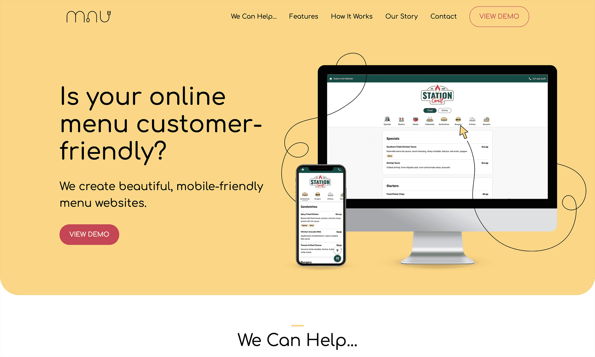
I designed and developed a working demo menu website. This demo demonstrates to customers the numerous benefits of an improved online menu experience.
Mobile-friendly
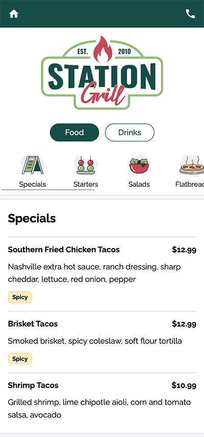
First and foremost, MNU menus are designed to be mobile friendly. This product is designed for restaurants who do not give paper menus to their clientele, but rely on customers scanning QR codes to view the menu on their own devices. On small screens, all components and font sizes are specifically designed with phone usability in mind.
Category Navigation
In contrast to PDF menus where the user must pinch and zoom to see menu categories, I designed a usable category navigation at the top of the menu. This allows the customer to easily glimpse all the categories on the menu and quickly jump to their desired section.
On small screens, the category navigation acts like a scrollable carousel. As the customer scrolls down, the category navigation sticks to the top on the screen and dynamically side-scrolls to match the user’s position in the menu.
Food and Drink Buttons
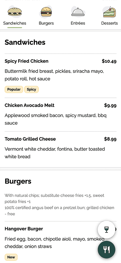
At the top of the menu there are food and drink buttons to switch between viewing food or drink items. As the user scrolls down, the buttons move to be located in the bottom right. This button position allows the user to easily reach them with their thumb on mobile devices.
Headless Content Managment
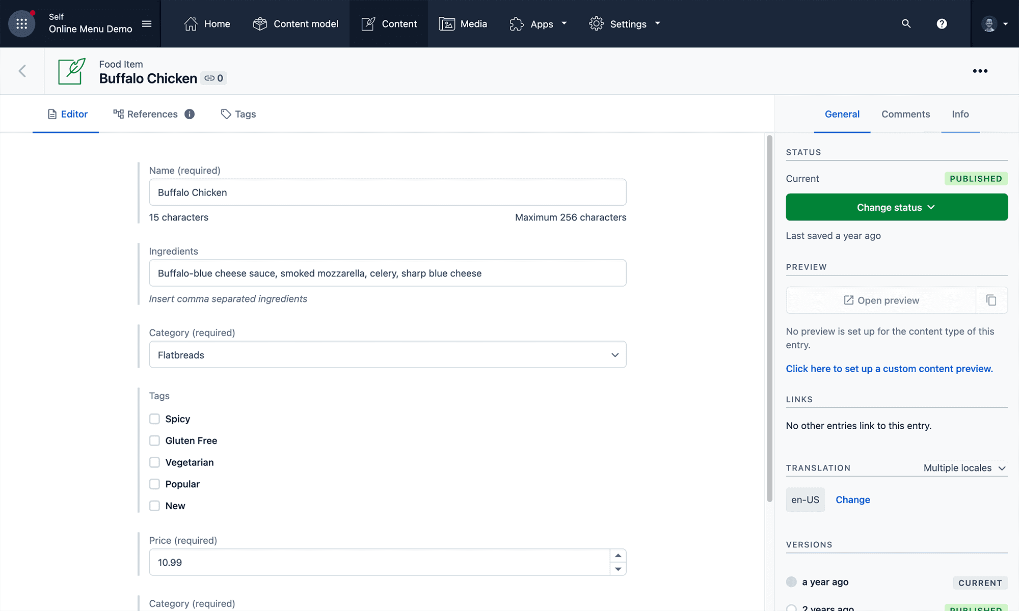
A headless content management system is simply a nice back-end interface where an author can write website content independently from the user interface. The content is then delivered to the website via an API and injected into the markup.
Restaurants need to change their menus often. It would be extremely time consuming to have to manage and make these changes as the developer. Instead, I hooked the website into a headless content management system so the restaurant owner is able to make changes themselves without the help of the developer. When changes are made in the CMS, the edits are automatically and immediately shown on the corresponding menu website.
Contentful
Contentful is a popular headless CMS. I choose Contentful to be the CMS for MNU because the user interface for writing content is very user friendly and the API is extremely fast.
📹
Marketing Landing Page
I designed and developed a landing page so restaurant owners can learn more about the product. The landing page features a video which better shows how a restaurant owner can easily update their menu, a features list, product benefits, and a contact form.
The contact form hooks into a 3rd-party service which sends requests from the form directly to my email inbox.
Features Backlog
This project is still a work in progress. In the coming months, these are some of the features I plan to implement.
Backlog (3)
Improve edit form UI
- Design
Tag filters
- Development
Animation hover category button
- Design
In Progress (2)
Focus button states
- Design
- UX
Add more padding between items
- Design
- Javascript
- Contentful CMS
- HTML & CSS